
When Does Promotion Become Too Much?
Furniture websites have a lot to accomplish. They need to showcase a large number of products while also promoting sales, financing, seasonal collections, and other offers. But when promotional content starts competing with the products themselves, the shopping experience can become harder to navigate. Let’s take a look at where this website gets a little too promotional.
1. Where Do Your Eyes Go?
The first thing I noticed about this website is how much visual attention is given to the promotional banner. Large text, a large background image, and a prominent call-to-action immediately take up most of the screen. While this can be effective for getting attention, it also means the actual furniture isn’t necessarily the first thing a customer sees. When I’m visiting a furniture website, I want to know what they sell before I feel like I’m being sold a promotion.
2. The Ads Keep Coming
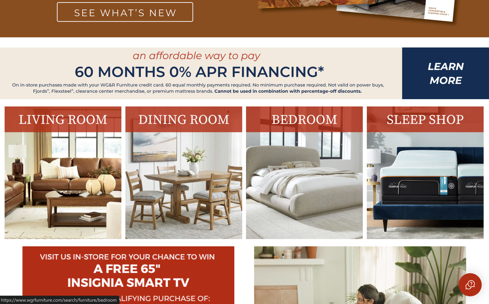
The promotional content doesn’t stop with the main banner. Below it, the website introduces financing, room categories, seasonal promotions, and additional shopping sections. None of these things are necessarily bad on their own, but when they are stacked together, the page starts to feel more like an advertisement than a place to browse furniture. Interestingly, the website became even more promotional as I explored it further. The main banner expanded while some of the smaller promotional sections underneath it were eliminated. This made me wonder how much space a website should really give to its advertisements.
3. What Is the Customer Here to Do?
At the end of the day, most customers visiting a furniture website probably have a goal in mind. Maybe they’re looking for a couch, comparing mattresses, browsing bedroom furniture, or simply getting ideas for their home. Promotions can certainly help customers find a deal, but they shouldn’t make the primary purpose of the website harder to accomplish. I don’t think the answer is to remove advertising completely—the real challenge is finding the right balance between promoting the business and actually helping the customer shop.
Author’s Final Thoughts
This website isn’t necessarily doing something wrong by using promotional banners. My concern is more about how much visual space those promotions receive compared to the actual shopping experience. When every section is trying to grab the customer’s attention, it becomes harder to know where to look first. Sometimes the best way to make a website feel less frustrating isn’t to remove information, but to make it clear which information matters most.
Disclaimer
*I do not own the rights to any images. All logos and descriptions of sites belong to their respective owners. This article is created strictly for educational purposes and will not be used commercially.