This Logo Has a Lot to Say
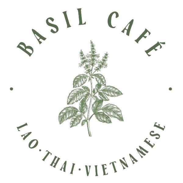
The current Basil Café logo has a nice foundation, but there is a lot competing for attention. Between the restaurant name, the basil plant, and “Lao, Thai, Vietnamese” there are several elements that the viewer has to process at once. The basil plant is a strong visual element and immediately connects to the restaurant’s name, but the circular text makes the overall logo feel a little busy. My goal with this redesign is not to completely change the identity, but to simplify it and make the logo easier to recognize at different sizes.
1. First Step: Identify the Current Logo’s Issues and Successes
The biggest issue with the current logo is not necessarily the amount of information, but how that information is arranged. “Basil Café” should be the main focus, but the circular layout makes the viewer work a little harder to figure out what they should read first. The additional text describing the restaurant’s cuisine is useful information, but it competes with the name instead of supporting it. At smaller sizes, all of these elements could also become difficult to read.
The basil plant, however, is a great element to keep. It gives the logo a recognizable visual and connects directly to the restaurant’s name. The green color also works well with the idea of fresh ingredients and food. Instead of removing these recognizable elements, I wanted to find a way to give them a more intentional role in the redesign.
2. Second Step: What is the Brand’s Mission?
At its core, Basil Café needs to communicate two things: its name and its food. The Lao, Thai, and Vietnamese description is important, but it does not necessarily need to be the first thing someone sees. When someone looks at the logo, I want “Basil Café” to immediately stand out while still giving the viewer a visual connection to the restaurant.
This led me to focus on the basil leaf as more than just an image in the middle of the logo. Instead, it can become part of the actual wordmark and help connect “Basil” and “Café.” This keeps the original concept recognizable while giving the logo a cleaner and more modern structure.
3. Third Step: Brainstorm Redesign Ideas
Plant Goodness
My first thought was to simplify the logo by moving away from the circular text and putting “BASIL” and “CAFÉ” on either side of the basil leaf. Interestingly enough, the two words are almost the same length, which makes this layout work pretty naturally. The basil leaf becomes the visual separator between the two words instead of having the entire logo built around the plant.
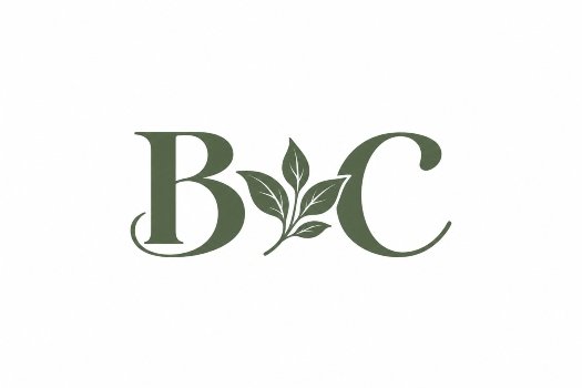
I also wanted to think about what happens when the logo needs to be much smaller. A full “BASIL (leaf) CAFÉ” logo may work well on a sign or menu, but it could become difficult to use on something small like social media, packaging, or merchandise. This is where a simplified B (leaf) C version could work as a secondary logo. It keeps the main idea of the brand while giving the restaurant a much simpler mark to use when space is limited.
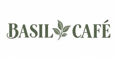
Initial review: This version feels much easier to read while still keeping the main personality of the original logo. The basil leaf remains an important part of the design, but it no longer competes with the name. I also like that the new arrangement gives “BASIL” and “CAFÉ” a similar amount of visual importance instead of making the viewer search around the circle to figure out what the restaurant is called.
4. Final Step: Would You Wear It? Test
A logo needs to work in more places than just a website or a design mockup. How does the redesigned logo look on a restaurant sign? What about a menu, takeout container, or social media profile? The full version should work when there is enough space, while the simplified B (leaf) C mark gives the restaurant another option when there isn’t.
How do you think it turned out?
Author’s Final Thoughts
I think the biggest improvement is that the redesigned logo gives each element more room to breathe. The original logo has personality and does a good job communicating the restaurant’s identity, but the amount of text and the circular layout make it more difficult to quickly recognize. By simplifying the arrangement and using the basil leaf as a visual separator, the new logo keeps the original idea while making it easier to read and reproduce. The addition of the B (leaf) C mark also gives the restaurant more flexibility for smaller applications without losing the connection to the full logo.
Content Disclaimer
*AI was used to assist with content creation; all design concepts and ideas are original to the author.
*I do not own the rights to any Basil Café logos. This redesign was created strictly for educational purposes and will not be used commercially.