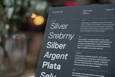
Fonts can completely change the way a website feels. Some websites use several different fonts to create contrast and personality, while others stick with one or two throughout the entire site. But how many fonts are too many?
1. More Fonts Doesn’t Mean More Personality
It can be tempting to use different fonts throughout a website because there are so many options to choose from. A decorative font might look great for a heading, while another one might seem perfect for buttons or smaller text. However, using too many different fonts can quickly make a website feel inconsistent and harder to follow. Just because a font looks good on its own doesn’t mean it will work well with everything else on the page.
2. So, How Many Is Enough?
I think the answer depends on the website, but keeping it simple is usually a good place to start. Using one font for headings and another for body text can create enough contrast without making the design feel chaotic. You can still create variety by changing the size, weight, or spacing instead of introducing another font every time you want something to stand out. The goal isn’t to use as many fonts as possible—it’s to make the fonts you choose work well together.
Author’s Final Thoughts
Typography is one of those things that can completely change a website without the user even realizing it. Too many fonts can make a site feel messy, while too few can sometimes make it feel a little flat. Finding the right balance can give a website personality while still keeping everything easy to read.