Fuzzy, Noisy, and an Odd… “Thumb”.
This logo needs a lot of work to be revamped into a more modern logo that connects with people more. Let’s get to work and flip this around!
1. First Step: Identify the Current Logo’s Issues and Successes
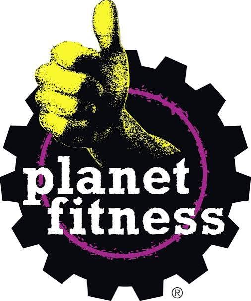
There are “planet-y” of issues with the old logo. However, the painfully obvious issue is the bright yellow thumb that sticks outside of the rest of the design. It also has a fuzzy texture that could make reproductions of this logo on products more difficult. The thumb also doesn’t immediately reinforce its main purpose: fitness. The purple outer circle has a blurred texture that may also be more difficult or costly to replicate in production. A solid line would be easier on the eyes and simpler to reproduce.
The gear is a nice touch, as most people would relate that to “work,” which one could say fitness is all about putting work in. The typography used is also cohesive with the gear, as they both show boldness. Together, these are still a unique combination.
2. Second Step: What is the Brand’s Mission?
According to Planet Fitness’ site, the official Planet Fitness mission statement is “to enhance people’s lives by providing a high-quality fitness experience in a welcoming, non-intimidating environment, which we call the Judgement Free Zone®, where anyone – and we mean anyone – can feel they belong.”
Their old logo tries to communicate a judgement-free environment, but the thumbs-up doesn’t necessarily communicate fitness or the broader Planet Fitness brand on its own. The new logo should still remain bold and gritty in a unique way. The typography helps sell this, along with the bold color contrast between the bright yellow and purple. The synergy between these two colors should not be ignored, as we know colors have important psychological meanings.
3. Third Step: Brainstorm Redesign Ideas
“Planet-ary” Fitness
My first thought was to approach this pretty literally—the planet aspect is entirely missing from this logo. How could we lean into a more “planetary” design while keeping it simplistic? My first thought was to add a Saturn-type ring around the logo, with yellow being the perfect color for this! However, the gear didn’t seem like it would work well.
I had the idea of swapping the gear for an iron weight plate. This does two things at once—it creates an opening for the outer ring to shine and ties into fitness directly. Quite literally, it hits the Planet aspect with the yellow ring and the Fitness aspect with the iron plate.
It’s time to mock up the logo! This may take a few attempts.
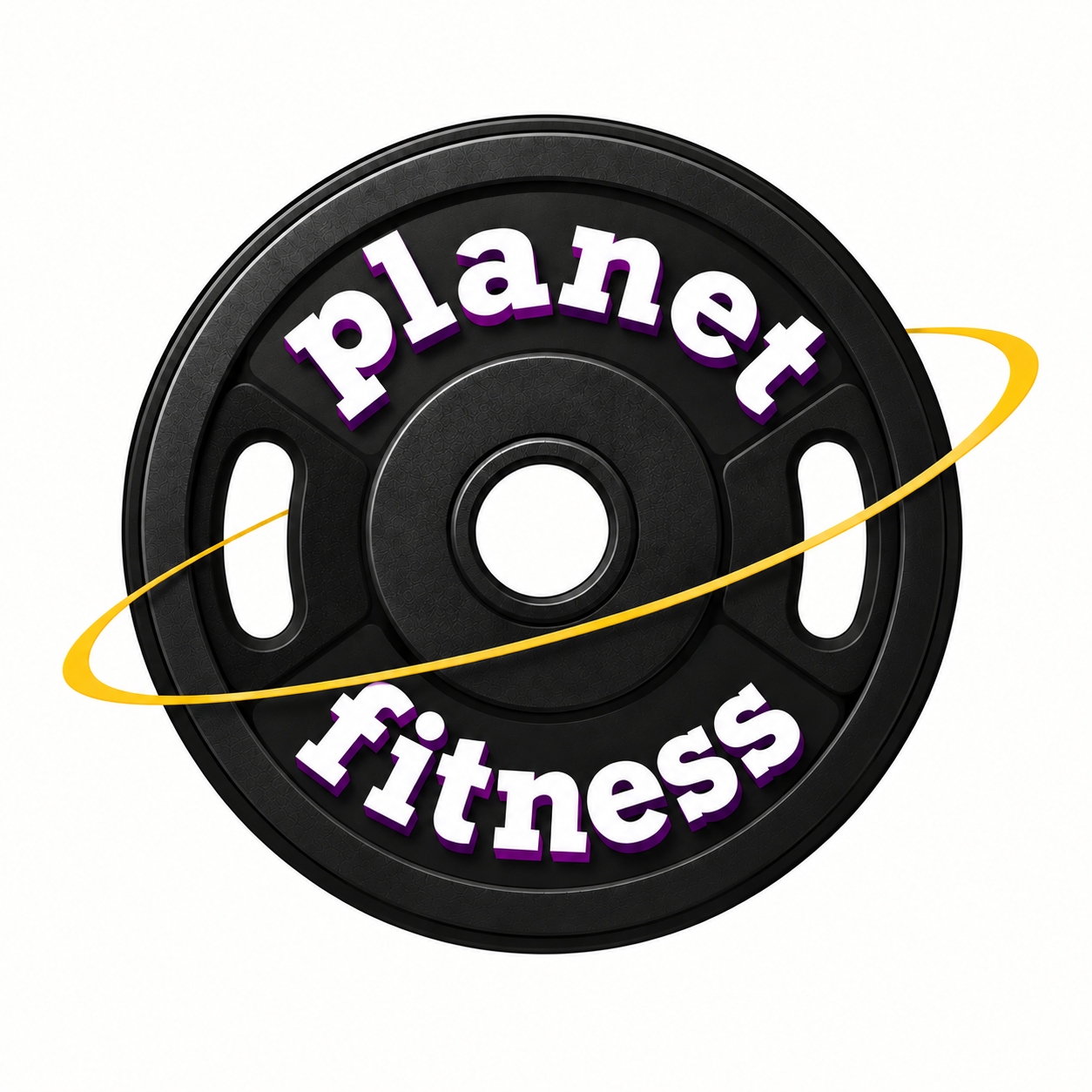
Initial review: This logo looks so much… younger? The thumb and the texture applied to the old logo was really aging their old logo! I think the ring and the iron plate turned out great. I have a couple of concerns with this. First, the yellow and purple are not connecting here enough—these would need to be slightly bolder. Lastly, I’m worried about how it will look on products. We will test that in the final test.
Gear Remains in Production
For this idea, I wanted to try removing the gritty typography and essentially uplift their current gear-forward logo. The gear itself can represent grit and thus fitness, if the other components are uplifted. However, I think more would need to be done to make this a logo that can truly last for years. Since the thumb used to be a large part of their boldness, I think the yellow needs to be a bigger piece. I like the idea of using the gear as a circular object to help connect the planet to their name more. Changing the orientation of the text to be in a circular angle would be perfect. Let’s see how these ideas merge together.
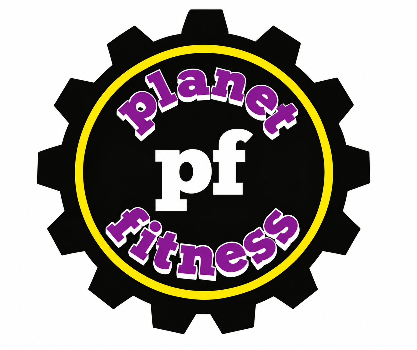
Initial review: This looks very cohesive together. The “pf” in the center grounds the entire logo. The circular text and yellow band reinforce the planet without using an actual planet in the design—it also reinforces the gear aspect in that it rotates. Lastly, the purple has a larger role, and it handles it nicely. Overall, this looks simplified and may be a huge improvement.
4. Final Step: Would You Wear It? Test
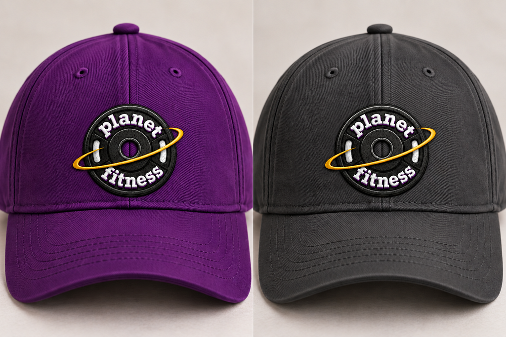
How do these logos hold up in the real world? Do they still work outside of a digital screen? How do they look on merchandise? Here are some examples.
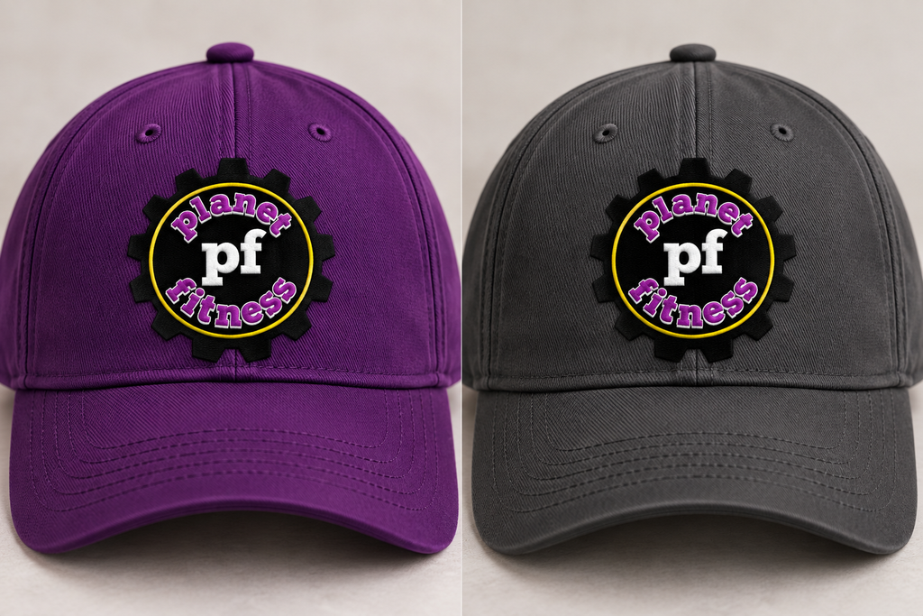
Which design is your favorite?
Author’s Final Thoughts
I have to give a “hat’s off” to design #2. The first design may be too far from their mission, which is ultimately focused on fitness rather than planets. The first logo is also missing the purple aspect completely, as the text shadow does not translate well.
The second design does a nice job of keeping their logo simplistic and easy to reproduce while still providing some of the main elements of their original logo. The large “pf” puts their existing brand identity front and center and does a nice job connecting it to the rest of the design. It also gives them an option to use “pf” in smaller reproductions. Most importantly, it looks very wearable as well!
Content Disclaimer
*AI was used to assist with content creation; all design concepts and ideas are original to the author.
*I do not own the rights to any Planet Fitness logos. This redesign was created strictly for educational purposes and will not be used commercially.