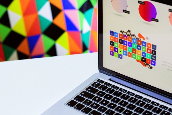
Has minimalism made web design too neutral?
For years, minimalist web design has leaned heavily toward white space, neutral colors, and simple layouts. While this approach can create a clean and organized experience, more websites are starting to bring color back into their designs. So, is color actually making a comeback, or are designers just finding better ways to use it?
1. Minimalism Doesn’t Mean Colorless
Minimalist design doesn’t necessarily mean removing color completely. A website can still have plenty of white space and a simple layout while using color to draw attention to certain areas. Buttons, links, headings, or even small accents can add personality without making the entire site feel overwhelming. I think the key is making sure the color has a purpose rather than using it just because it looks nice.
2. Color Can Create Personality
A website can be clean and minimal while still having its own personality. When every site uses the same white, gray, and neutral color palette, it can become harder for a brand to stand out. Adding intentional colors can make a website feel more memorable and help communicate what the brand is about. Sometimes, a little color is all a website needs to feel less generic.
3. Less Color, More Purpose
I don’t think bringing color back means websites need to become colorful just for the sake of it. Too many colors can create the same visual clutter that minimalist design is trying to avoid. Instead, using a smaller number of intentional colors can help guide users and make certain parts of a website stand out. The goal isn’t to use more color, but to use the right color in the right places.